TabBar widget
Path: Widget Gallery> Basic> Control> Horizontal tab
Path: Widget Gallery> Basic> Control> Vertical tab
The widget should contain a list of checkable buttons (one or more) where one and only one button can be checked at a time (in the example image only the Tab 1 button is checked). When the size of the widget is not sufficient to show all checkable buttons, two other buttons (the two arrows in the image) should appear in order to control the viewport position. In the example image, only the right button is enabled; we will refer to these two buttons as viewport buttons. The embedded gestures to scroll left/right the tabs bar are supported.

TabBar properties
| Property | Description |
|---|---|
| Current Index | The currently checked tab button (default 0) |
| Button Expanding | When true, the buttons will adjust to take up all available space |
| Minimum Button Size |
Minimum Button Size "Text Elide Mode" and "Button Expanding" can increase the size of the button |
| Background Color | Color used for unchecked tab buttons and for disabled viewport control buttons |
| Foreground Color | Color used for text and viewport buttons icons |
| Accent Color | Color used for the checked tab button and for enabled viewport control buttons |
| Text Elide Mode |
The display mode when the text is too large. Can be
|
| Icons | Icons parameters |
| - Expanding | When true, the icons are expanding to use all available space |
| - Position | Icon position |
| - Min Width | Minimum width for icons |
| - Min Height | Minimum height for icons |
| Viewport | Viewport buttons parameters |
| - Mode |
The visualization mode of the viewport control buttons. Can be:
|
| - Button Size | Size of the viewport buttons |
| - Position |
The viewport position (should be between 0.0 to 1.0) This property is useful for connecting the viewport of two TabBars to each other, in order to synchronize the visible buttons (for example identical TabBars on different pages) |
| Tabs |
Tabs configuration. Each tab can have:
|
| Style |
TabBar Style There are some predefined styles ready to use and a custom style. By selecting the "Custom" style, the new "Custom Style" sub-folder will appear with a list of all the style properties that can be used to precisely define any display details. |
| Custom Style |
Available only when Style = Custom All the properties that are used to draw the TabBar widget. |
TabBar buttons configuration
Double click over the TabBar widget or press the Tab property to open the "TabBar buttons configuration". From this dialog, you can define the label, the icon, and the action associated with each button.
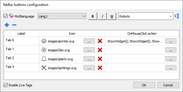
The text in the label supports the live tag placeholder (See "Live Tags")
ToolBar widget
Path: Widget Gallery> Basic> Control> Horizontal toolbar
Path: Widget Gallery> Basic> Control> Vertical toolbar
The ToolBar widget is a list of clickable buttons that does not keep the status of the "selected button". All properties are the same as the TabBar widget with the exception of the "Current Index" property that is missing. (See "TabBar widget")
